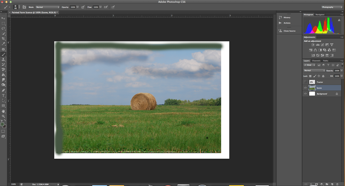
Currently I just finished this tutorial where I manipulated the clarity of the image. As you see the lower portion of the grass has a sharp contrast to its upper half. Also I darkened the clouds to as a vivid essence to the image. The last portion of the project was to draw a line trough the upper left hand cornet which I did by sampling the green coloring of the bushes and utilizing the paint tool as a method to draw the line.
Here are some photos I shot for the Silhouette assignment. What I had to do for this assignment was I had to adjust the ISO and shutter speed to create a image where the center of the piece was darkened while the background stayed vibrant. Also to adjust the camera I had to meter it facing directly at the sun and also shoot the picture facing the same general direction. The result is these two pictures. I feel as though I relatively achieved the goal of this assignment because the objects are silhouettes.
Currently in this Class at the moment we finished editing a little boy from our Photoshop Tutorials. What we had to do was manipulate the background in order to create a vin-yet. To do this I took a shade of red a a tint of blue from the boys shirt and combined them to mold a background. In the camera shot below was some depth of field shots we had to take with either a wide or narrow angle. I wanted to do a shallow depth of fields shot which expresses how the plant leaves are in detail and the background of the tree has a sharp decrease in detail. I plan on editing this picture to make it lighter which will enhance the view of the picture overall.
Here is my redesign of my T-Shirt design submission. SInce Gear Up is sponsoring the event the needed a sponsorship within the design so I simply changed the WASC to Gear up and added a gramatical S to the Let. 1.) What I like most about my T-shirt design is that I used previous knowledge from photoshop to create this logo for my digital photography class.
2.) What I would do differently would be using illustrator instead of photoshop because that is what would be best for this graphic design assignment however I felt ill prepared to drift away from photoshop. 3.) What I learned about quick dead lines is that you have to gain inspiration from anywhere in order to create a piece of work. 4.) What I like about photoshop is that I have the capability to give photos life again even though the camera the look like bad pictures. Photoshop gives me the ability to bring another phase in photography. Here is my submission to the WASC Tee shirt design. Honestly I know the design is horrible. Through out the course of this year I had been using photoshop entirely and then when I was assigned this project I was unable to use illustrator because I had had no training for it at all. So I was forced to use photoshop for this project despite the leniency toward illustrator. All the acrediations for the logo were taken off the Mission Hills Website itself.
This photo was captured by Erik Johansson in 2008. Johansson is a swedish photographer who takes mulitiple pictures and combines them to created amazing works of art. In this image you can see a woman hanging a painting up and gazing into its beauty. The bottom layer of the photo is appearing to be pouring water out and onto her wood floors which is Johansson's intended illusion. As explained in his TED video, Johansson could've taken pictures of running water, a splash, a puddle, a painting, a hammers and nails, the woman, and her reflection in order to combine the into this one composition through the power of photoshop. The elements in this photo include texture, color, and space. The texture of the water helps to add more contrast to the photo. The cool colors of the walls and on her shirt help to calm the photo down and create a more relaxed mood that draws away from the fact that her house is flooding. And finally the space in the photo is expanded into the painting because the running water helps to make the scenery turn into a real space. On this specify composition, Johansson make the woman's head in a focal point because it helps to balance the photo away from the water and the reflection; in addition, having the painting in the top half helps to balance the picture from the heavy attention the running puddles gets. This photo is one thats truly has a thousand word description. This was a personal picture take by myself. What I wanted from my picture was to have a subject disregard the background almost to where they are ignoring it. In order to take this silhouette I had to dramatically lower the iso setting and shutter speed. The result is this. I included the building to the right because it helps decrease the size of the subject to where it isn't consuming the entire image. When capturing this image I wanted to include certain elements such as the bird on the roof, or the landscape within the background so that it will give the picture more depth and meaning so that the picture can be viewed from different perspectives. An element included in the image include low color such as the sky that vividly matches with the figure.
THIS PHOTO CAPTURES A FLOCK OF BIRDS RESTING IN A POND. BY TAKING THE SHOT WHEN THE ARE BEGINNING TO FLY EXPRESSES MOVEMENT WHICH HELPS TO GIVE THE PICTURE THE DIRECTION OF MOVING UPWARDS. THE MOUNTAINS IN THE BACK GROUND ALSO HELP TO DEVELOP THE BACKGROUND AND GIVE A IDEA OF SPACE FOR THE IMAGE. THE WATER ASLO SHOWS AMAZING TEXTURE THAT CAPTIVATES THIS PICTURE.
|
AuthorMy name is brett and these post are for my digital photography class . Archives |